I enjoyed the different explanations of theories of photography throughout this chapter. I've never explored these formal ideas and this chapter prompted some new thoughts in my mind. I found it interesting how fine art related to photography in the 60's and 70's through pop art.
Landscape as a genre in photography and fine art has always been interesting to me, especially with my major and studying the transcendentalists. At first these landscape photos depicted a sublime, surreal and perfect environment, usually with some kind of higher being connotation in the image. As photography and fine art progresses it's obvious that not only are beautiful images of nature are created, but images of the degradation are represented more frequently in our constantly developing world.
The chapter described the postmodern theory of photograph and how
it's centered on staged or constructed photographs. This concept made me
question: Can staged photography be considered photo journalistic or authentic?
I also wonder if photography became so popular in the fine art world because of it's reference to the medium of fine art.
Tuesday, March 27, 2012
Sunday, March 25, 2012
GOOGLE READER RESPONSE #8
This week I found the work of Anna Schuleit to be very interesting. Her series "Bloom" includes many images of flora that was planted in a Mental Health Center in Massachusetts. This whole concept of bring the outdoors to interior spaces is very interesting to me. The implications of placing these plants in a Mental Health Center has some very inspiring connotations as well. Her website is very interesting, I'd suggest checking it out!
 Another series that caught my eye this week was Robin Schwartz's photos of her daughter and animals. This images are very different and shows a strange relationship between this growing young girl and animals. I love that these photos have a certain vernacular quality but are still computationally very intriguing.

 If you look through the collection of these photos on her website, you can see how the images progress to be more formal in the qualities of light and composition as her daughter, Amelia, gets older. These images were in the NY Times this Sunday too!

Sunday, March 18, 2012
WORK IN PROGRESS #3

These images are
quite different from my other sets of images.
I’m trying to evoke a fleeting landscape. I feel that this urbanized environment is why
we must replicate nature in our front yards.
Through exploring our concrete and developed world, I hope to depict the
lack of the native natural world in our everyday lives.


I wanted this
first image to be a bright and sunny image.
I feel that the warmer, lighter tones convey something different within
this image. I wanted the plant to appear
like it was basking in the sun, surrounded by concrete. I purposely created a warmer color cast to achieve
this purpose. After printing the image
I am seeing a lighter spot in the middle foreground of the image that I would
like to work on furthermore, it appears a bit distracting.
The second image
was intended to contrast the warm colors of the first image. I wanted to see how I and the viewer might
react to a darker and cooler image. With
the cooler color cast, a sense of isolation is starting to surface within the
image. The bluer tones create a less
natural hue to the image, highlighting the concrete texture and vastness. I would like to emphasize the yellow color in
the flowers a bit more within this photo. It also might be interesting if the edges were
blurred a bit more.


Tuesday, March 13, 2012
CHAPTER 5 READING RESPONSE
Chapter 5 has a lot to do
with the consumer culture and how it relates to photography. The author
speaks about how society is surrounded by all these photographs that are
embedded in our brains as authentic and real, but they are actually creating a false
consciousness in society. These photographs are selling products and
services. As we have become so accustomed to this consumerism, we have
also become passive consumers, allowing the false consciousness and
hyper-reality to be engrained in our culture.
Even photojournalism, the ultimate authentic photography medium is surrounded by this idea of the spectacle, trying to get people's attention through manipulation. PR companies were hired to cover war coverage to hide the reality from the mass media. For newspapers and magazines, more intense photos get better news stories and therefore higher ratings for that media outlet. The first photographer that came to mind while reading this was Allan Arbus, a lot of his pictures were used in Glamour and Vogue.
The author also brings up an interesting idea that commercial photography constantly borrows from ideas within our culture and by doing this, it has perpetuated stereotypes. I also enjoy when the author mentions that commercial photography never challenges the status quo. At first, I don't know if I completely agree with this, I feel our culture is shifting a bit more to understand that we are manipulated by media and some outlets do challenge some ideas. I think since media is so strong, that it would be very interesting to see media challenge societal norms more often.
After reading the chapter, I found myself asking these questions:
Does the influx of commercial photography affect our ideas and perceptions about fine art photography? Do we expect more/less from fine art photography because of how flooded our culture is with advertisement?
How do you feel photographs could be used in advertising without creating a false consciousness?
Do you think that people are becoming more aware of how the media changes their perceptions?
Sunday, March 11, 2012
GOOGLE READER RESPONSE #6
So many great photos were on the different blogs this week, but here are some that I found interesting...
First off is this adorable Coonhound, Maddie photographed by Theron Humphrey, featured in both LPV and Lenscratch this week.
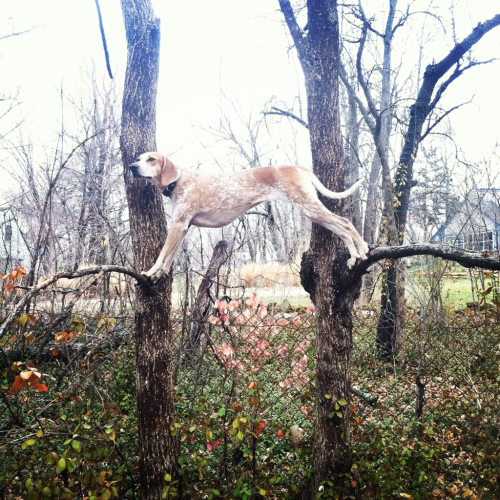

There is a whole tumblr and blog phenomenon associated with these images and Maddie. Not only is she great at posing, all the images contain a very interesting background/foreground for Maddie to interact with. Every image is unique, and they are extremely well put together. Theron Humphrey's work is great after I looked around at his website. I enjoy his over all style and his use of color, his images are all very stylistic with a certain soft mood and tone that comes across.
Looking through the blogs, I also found Jessica Auer. Her work relates to a lot of the work I've been producing, or at least trying to produce, for my final project. I like that Flak photo deemed her a "documentary-style landscape photographer". Looking through her other images on her website, I was very intrigued by the beauty of all her different landscape photography, and how vibrant and clear her photos are. This photo below in particular shows the direct relationship of the landscape and development that I've been striving for in my WIP #3.

First off is this adorable Coonhound, Maddie photographed by Theron Humphrey, featured in both LPV and Lenscratch this week.

There is a whole tumblr and blog phenomenon associated with these images and Maddie. Not only is she great at posing, all the images contain a very interesting background/foreground for Maddie to interact with. Every image is unique, and they are extremely well put together. Theron Humphrey's work is great after I looked around at his website. I enjoy his over all style and his use of color, his images are all very stylistic with a certain soft mood and tone that comes across.
Looking through the blogs, I also found Jessica Auer. Her work relates to a lot of the work I've been producing, or at least trying to produce, for my final project. I like that Flak photo deemed her a "documentary-style landscape photographer". Looking through her other images on her website, I was very intrigued by the beauty of all her different landscape photography, and how vibrant and clear her photos are. This photo below in particular shows the direct relationship of the landscape and development that I've been striving for in my WIP #3.
Subscribe to:
Posts (Atom)